ABOUT
THE PAINTINGS
"To encourage others to look at the world differently. This is what I see as the primary purpose of an artist.
When I look to the skies of Scotland I see it in precisely the same way as my prehistoric ancestors. What new perceptions can I offer? Nothing... there is nothing new, it has all been conceived of before.
However, as an artist I can realise these perceptions and ideas visually in a refined craft in order to portray a unique vision".
- Excerpt from 'Scottish Skies'

ARTIST STATEMENT
In a career spanning 20 years my painting style has evolved from a literal, more traditional depiction of the Scottish landscape and skies, to non literal. Colour is used more to suit an idea than the subject itself.
My work explores cloud cover and its effect on light and colour. I paint transitional skies as a metaphor for light from darkness, in keeping with the overarching themes of hope and optimism.
My inspiration comes from three main sources: Turner for atmosphere, Matisse for colour and the Expressionists for their freedom of paint application.
Matisse said, “I don’t paint things. I paint the difference between things”, a sentiment I agree with wholeheartedly.

Sun's Energy | 100 x 100cm | Oil on linen
I get inspiration through flying a drone across the Scottish landscape. At first, the drone was simply another way to literally look at the world differently and to expand the possibilities of impossible vantage points. Latterly, the abstract forms that revealed themselves from high altitude began to resemble mark making I used to describe foreground at ground level, bringing about a theme of fractals.
I then went on to produce a body of work I called ‘fractal landscape’, where altitude became ambiguous. The viewer would then question whether or not it might be an aerial viewpoint or ground level.

Harris Fractals | 100 x 150cm | Oil & acrylic on linen
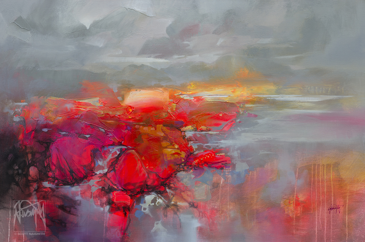
I am constantly questioning what I see. Molecular physics does the same. In the study of particle physics, we can go beyond what the eye sees. Colour is a figment of our imagination designed to decipher different wavelengths of light, but only within the confines of the visible spectrum. Our hearing does the same with sound within audible parameters. Our brains decode the world around us in a way which allows us to function within it.

Molecular Bonds II | 100 x 150cm | Oil & acrylic on linen
My paintings are not designed for the viewer to function within it, their purpose is to stimulate a different response, to excite and ask questions as opposed to answering them. We cannot corroborate our experience of color with another of our senses. We can’t touch or hear or smell the differences in it. This makes it ideal for me to experiment with the beauty of color with the freedom of realizing my brain’s limited perception of it. I often like to think of what we were to see if the resonant sounds were perceived in color.
Other artists I find myself inspired increasingly by include Turner, who created ephemeral atmospheric effects using large washes of liquid paint. Nicolas de Stael, Willem de Kooning, Samuel Peploe, Francis Cadell, Glasgow boys: Guthrie Lavery, Henry... and Joan Eardley.
STATEMENT FROM KEN LEMOND
LEMOND GALLERY, GLASGOW
"Steeped in the Scottish landscape (West Coast and the Western Isles), Naismith captures (in a modern way) everything that is special and magical about Scotland (one of the most beautiful places in the world!)
He uses a formalist approach where form (expression) is more important that the accuracy of representation. In doing so he is successfully celebrating and communicating the spirit of Scotland and our underlying sense of optimism.
Naismith deconstructs the elements that are contained within a scene - the hard elements (the earth), the liquid and the air. He also looks at the changing weather and light conditions. Rather than represented colour, he applies colour to reconstruct, exaggerating and highlighting the interaction of the various elements, including variations in the land geology and in light refraction and filtration.
We are led by him through the canvas to enjoy and celebrate his crescendo - the force, power and beauty of the natural elements.
Credit to Naismith - his has a considered and cerebral approach, which makes him 'artistically' very special and sets him apart from many of his peers.
The quality of his thought and approach will ensure that his contribution is enduring and is included in the art history timeline for Scotland".
THE TRUTH ABOUT THE COLOUR WHEEL
Through teaching colour at Reid Kerr College to Graphic Design Students, I became aware that the syllabus for colour theory and mixing is flawed. My recent work explores the 'truth' about the colour wheel which is that Cyan, Magenta and yellow (not blue and red) are the primaries of the subtractive colour system. My video: 'The Truth About The Colour Wheel' explains the technicalities of this concept.


Primary Sky | 80 x 80cm | Oil on linen


